A new way to look at job hunting
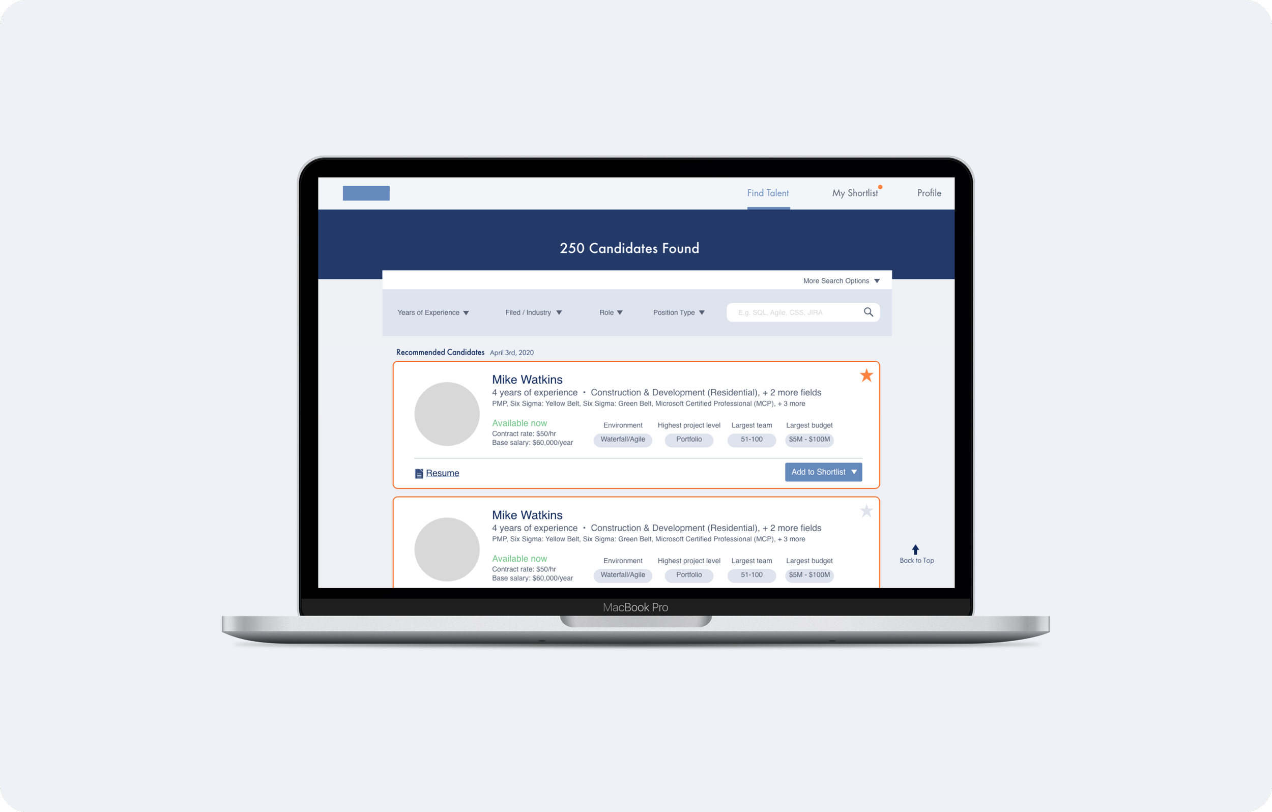
TalentMarketPlace helps match talents with talent seekers. Although with an existing website already serving their recruiters, they are looking to improve their user experience. Because of the lack of a designer on the team, their design was outdated and there were a lot of unchecked design decisions that resulted in confusing user flow. TalentMarketPlace is looking to improve its product’s user experience and create less friction to attract more recruiters.
Project Type: Co-op Project
Project Duration: 12 weeks
My Role: User experience designer

Problem scoping
TalentMarketPlace
TalentMarketplace offers a curated talent pool of project professionals (project managers, coordinators, and business analysts) available for hire. They provide internal recruiters and hiring decision-makers access to our on-demand talent pool, which provides references, resumes, and key stats before you engage with the candidate. Machine learning matches candidates and employers. Unique filters allow you to generate a shortlist of quality, available PMs, BAs, and Coordinators instantly. Resumes, references, and key information inform your decision to move forward with interviews and hiring.
What does TalentMarketPlace need
Although with an existing website already serving their recruiters, they are looking to improve their user experience. Because of the lack of a designer on the team, their design was outdated and there were a lot of unchecked design decisions that resulted in confusing user flow. Because their main source of profit comes from recruiters, they are the main target audience for this product. In the user flow chart I drew for recruiters, I found a few paint points and opportunities.
With the current flow, there is a mandatory authentication process, which means the recruiters have to wait or reach out to the company if they want to proceed. This creates a huge blocker for companies to process before reach the site.
Because it is both for participants and recruiters, the login and signup portals are very confusing. Sometimes you don’t know if you are signing up to be an employer or participant until halfway through.
Competitive research
There are a lot of major job-hunting platforms such as Indeed or Linkedin and they all have competitive advantages. I mainly look at how they display candidates and the process of searching and filtering. I noticed that
User research
We found two active users to provide us with some insights into their experience using the product. Two of them are employers and they have hired someone from the website. Each in-person interview was about 30 minutes long. I found some patterns and similarities:
They wished they could sort their shortlisted candidates.
There is not enough effective feedback for both confirmation and errors and it is confusing.
They think having a profile page will be helpful in managing their personal information
Finding a delightful path
Disconnections are opportunities
Because there are two types of target audiences, when creating user flow I made sure to include both scenarios and look at it separately.
Participant: Looking for a job, views the website more like Indeed or Glassdoor, they want to see job postings that fit their occupation. Apply for jobs and potentially foster relationships to raise their chance of getting hired.
Recruiter: Looking for talent, they want to see if the participant's skill matches with their job description. If they find a talent they want to hire, the company will want to find ways to shortlist and candidate and move them along the interview process.
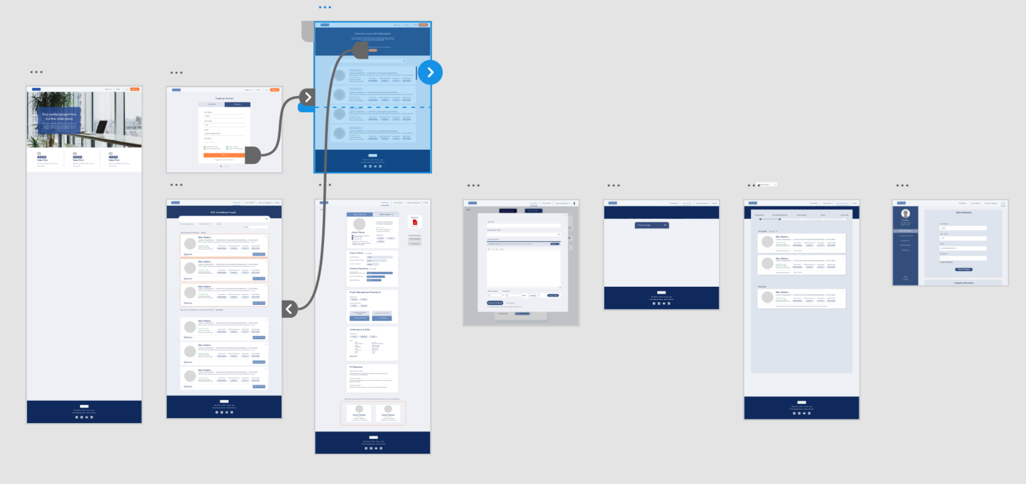
Recruiter flow
Participant flow
With the ideal user flow in mind, I converted texts into a rough wireframe that can be translated into visual language. To solve the problem I found in the early stage, the pain point transforms into a new opportunity to improve the user experience. Combining with the user interview feedback I got, I have concluded in fixing these aspect in order to improve user experience:
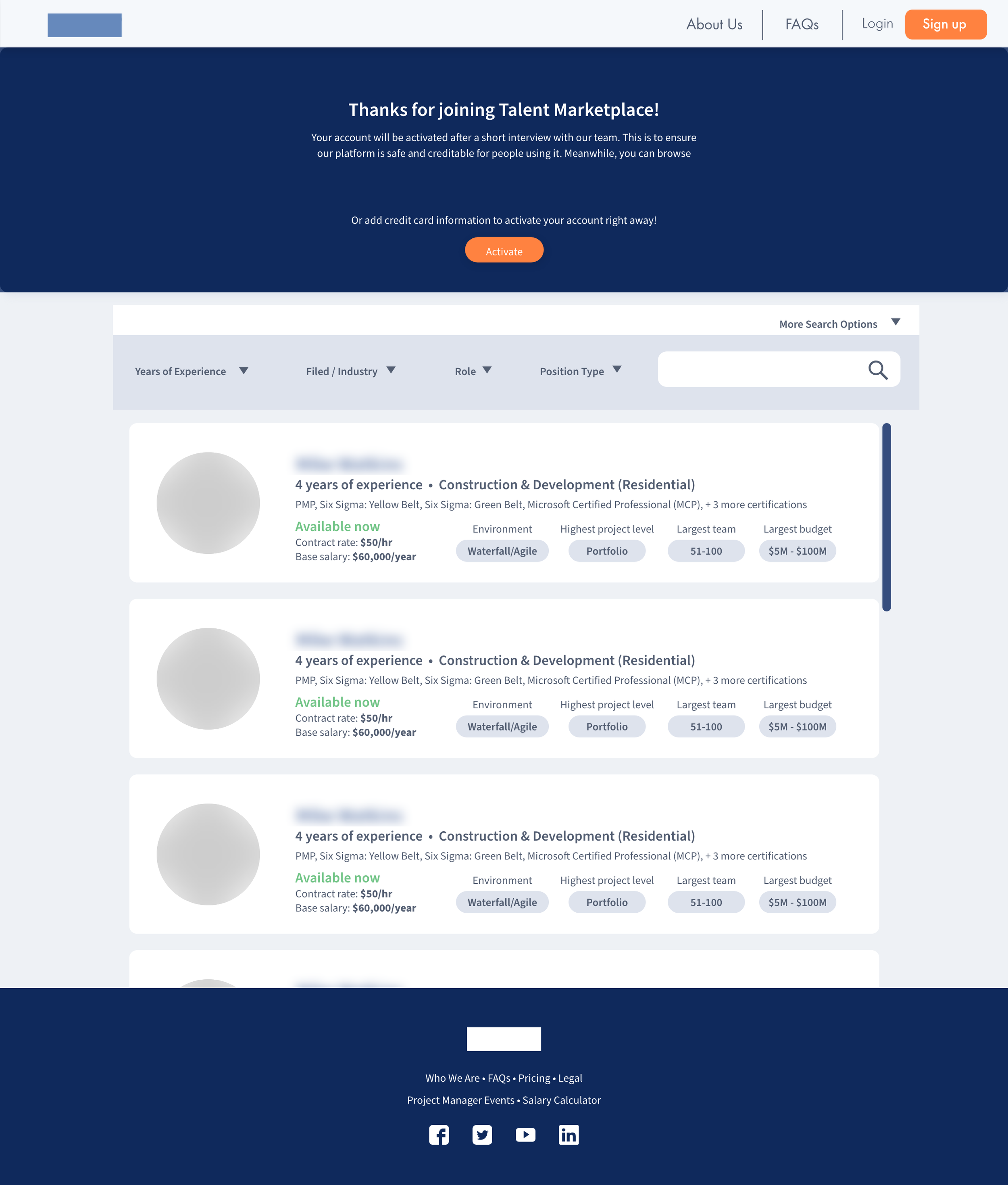
While the recruiters are waiting to get verified, they get a sneak peek of the amazing talents available on the site, decreasing the dropout rate.
They should have a profile page/setting page to see the number of talents they interview, they should also be able to track the progress of the interview, knowing the average hire rate.
Shortlist should have better functions allowing them to shortlist for different roles.
There should be separate sign-up / sign-in portals for employers and participants.

Authentification process
While the recruiters are waiting to get verified, they get a sneak peek of the amazing talents available on the site, decreasing the dropout rate.
Separated Sign up
While the recruiters are waiting to get verified, they get a sneak peek of the amazing talents available on the site, decreasing the dropout rate.
Better shortlisting system
Now you can create multiple shortlists and be able to sort them. You can move candidates from list to list. Under each shortlist, it is also sectioned by interview stages. And you have a dedicated place to view your started candidates.
Email template and salary insights
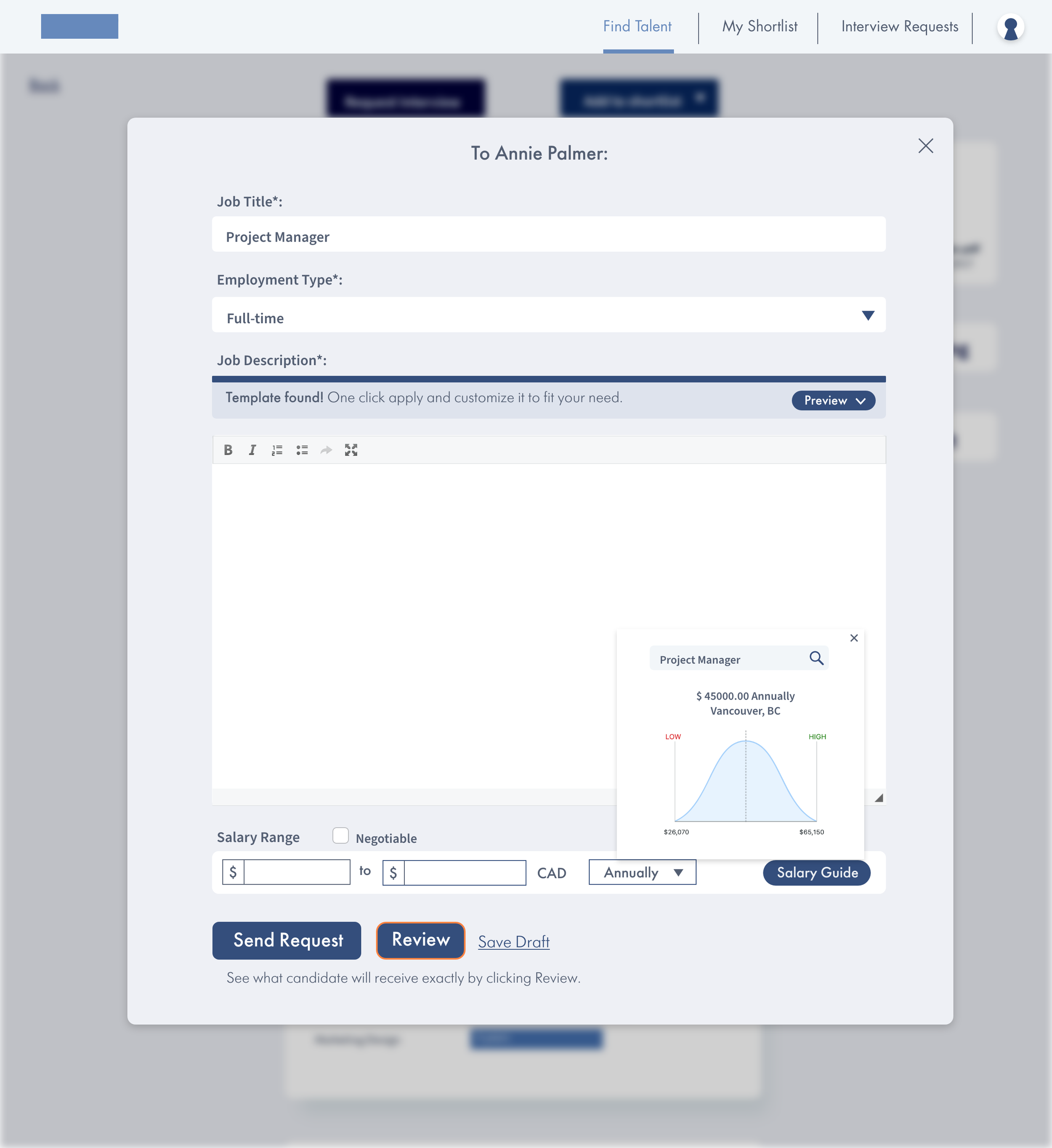
Recruiters can draft an invitation or offer with AI-generated salary insights. This allows employers to send multiple offers to grouped candidates in shortlist to save time, and it’s easier to manage.
Takeaways
My second co-op experience as a designer specializing in user experience has been a transformative journey, significantly enriching my skill set and professional outlook. I am happy that I get to focus on building user experience and engaging in user research, I find the process of looking for opportunities in pain points enjoyable because it provided me invaluable insights into user behaviors, preferences, and pain points.


